[Client] Erratum
[Role] Graphic Design
Logotype and research packaging for a French winemaker located in the Loire region. The brand identity gets its roots from the abbey architectural where the Château is located. The design showcases details of the stained-glass windows and the arch ceiling of the church, as well as an artistic illustration representing the nature growing in the vineyard, inspired by the Virian family biodynamic principles. I worked on a range of 3 labels, following a neutral color code according to the type of wine.
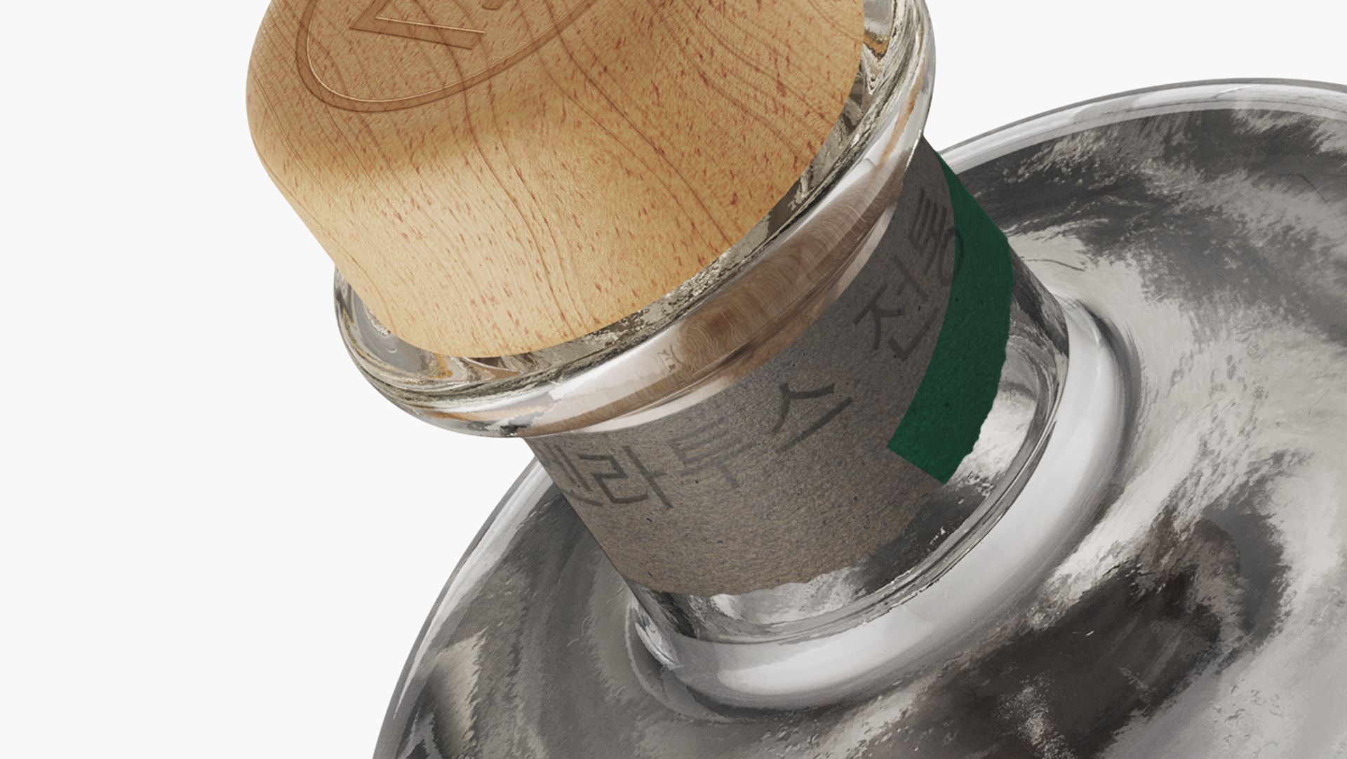
The label is printed using a meticulous stamping technique and high-quality textured paper.

